Sometimes, the truest tell of a homeowner’s age lies in the details of their decor. From once-trendy patterns to beloved (but dated) furniture choices, certain items can unintentionally tell someone’s age.
In today’s blog, we will discuss the design choices that hold a special place in our hearts but are no longer in trend. We have also mentioned the modern alternative of the styles, so let’s look at them.
Beveled Glass Cabinets
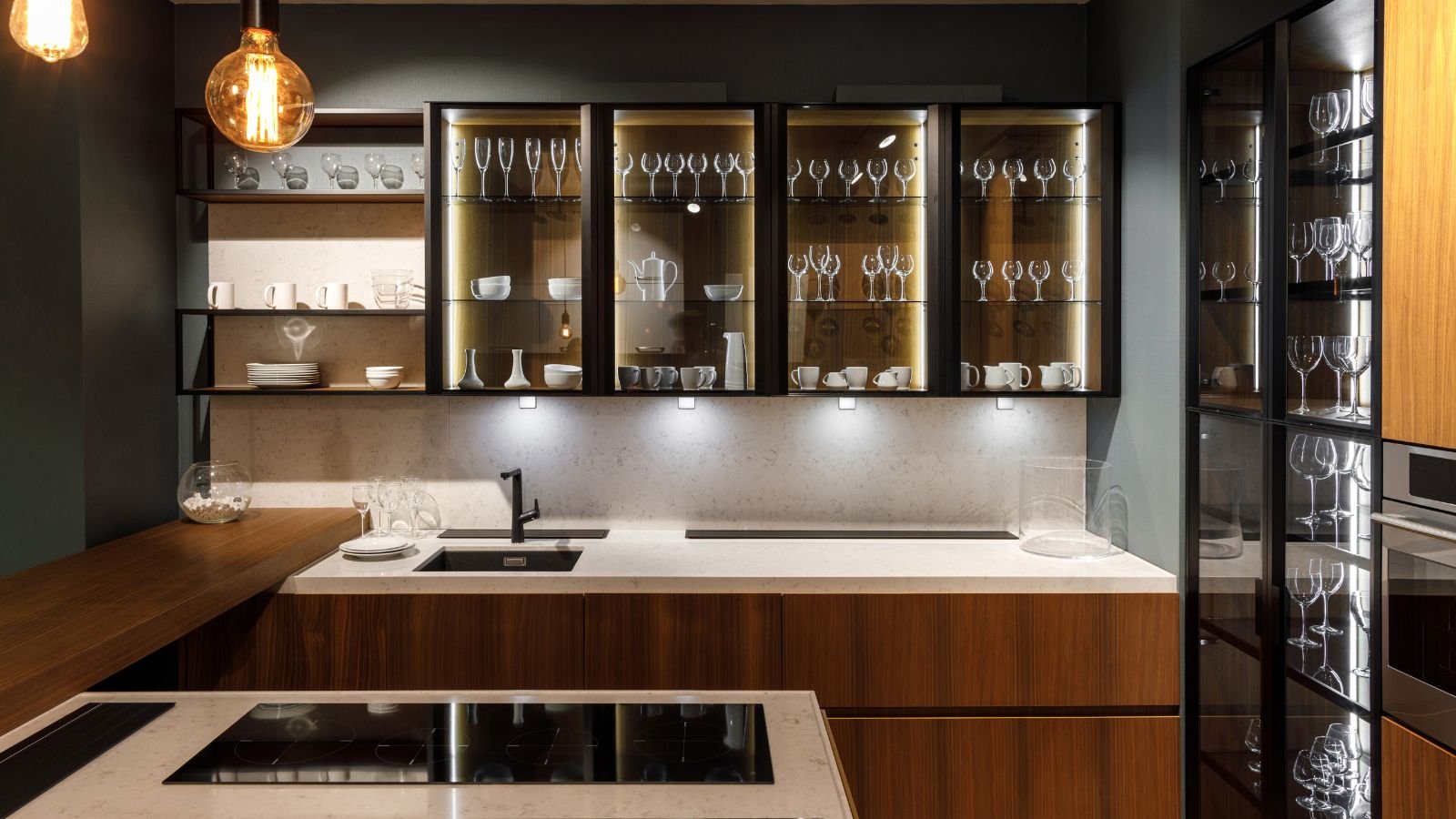
Once a hallmark of luxury kitchens, cabinets with beveled glass inserts have fallen out of favor. The ornate, multifaceted glass adds a layer of visual clutter that disrupts the clean lines now central to modern kitchens. Light-reflecting off the bevels can create a sense of busyness, and the framed sections visually break up the clean planes of the cabinetry. This clashes with the contemporary emphasis on minimalism and functionality.
Floral Chintz Sofas
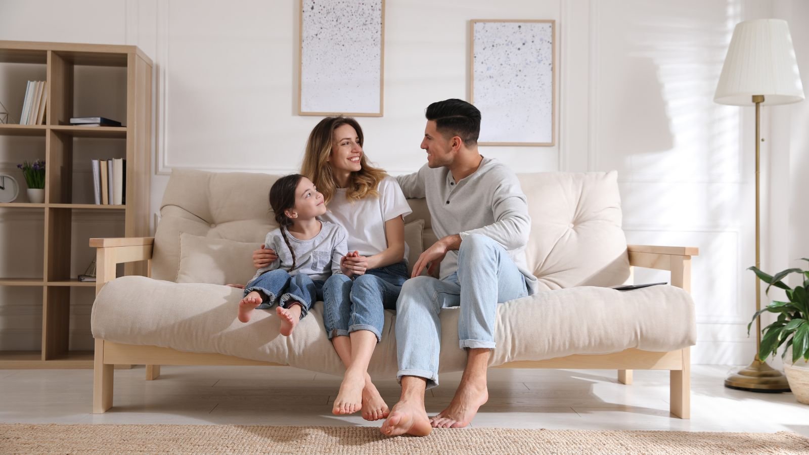
Chintz, a fabric characterized by a densely packed floral pattern, was a popular choice for upholstery throughout different centuries. However, its busy design can overwhelm a space and clash with modern aesthetics. The tightly packed floral motifs, often featuring large blooms and busy arrangements, can create a sense of visual chaos, especially in smaller rooms. Additionally, chintz is a relatively delicate fabric prone to fading and wear. Today’s trends favor solid-colored fabrics or those with more subtle patterns, such as textured weaves or geometric designs.
Brass Fixtures

Brass, with its warm, golden hue, was once a ubiquitous metal finish in bathrooms and kitchens. Its traditional appeal offered a touch of timeless elegance. However, its popularity has waned in favor of cooler tones like chrome, nickel, and matte black. These finishes provide a more contemporary and polished look. Chrome and nickel offer a reflective quality that complements the clean lines of modern design, while matte black adds a touch of drama and sophistication.
Decorative Tile Borders
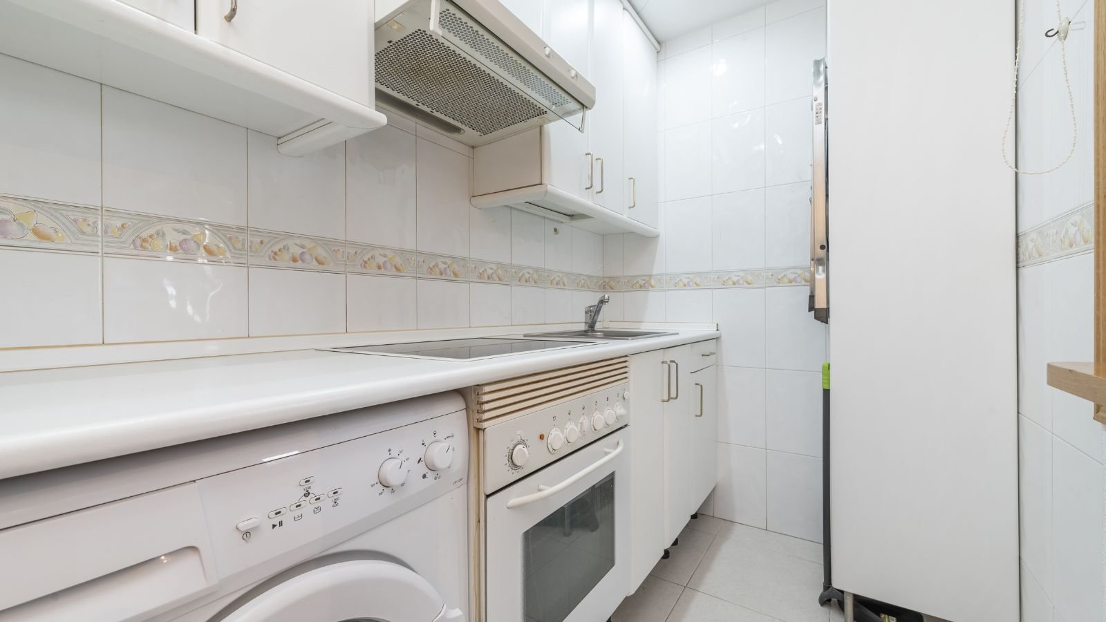
While intricate tile borders were once used to add a decorative touch to bathrooms and kitchens, they are now considered excessive and outdated. The busy patterns of these borders, often featuring floral motifs or geometric shapes, visually shrink the space and can be challenging to maintain. The grout lines within the borders create additional areas that require cleaning and can be prone to mold and mildew growth. Modern trends lean towards using a single statement tile throughout the space, creating a clean and expansive feel.
Victorian-Style Wallpaper
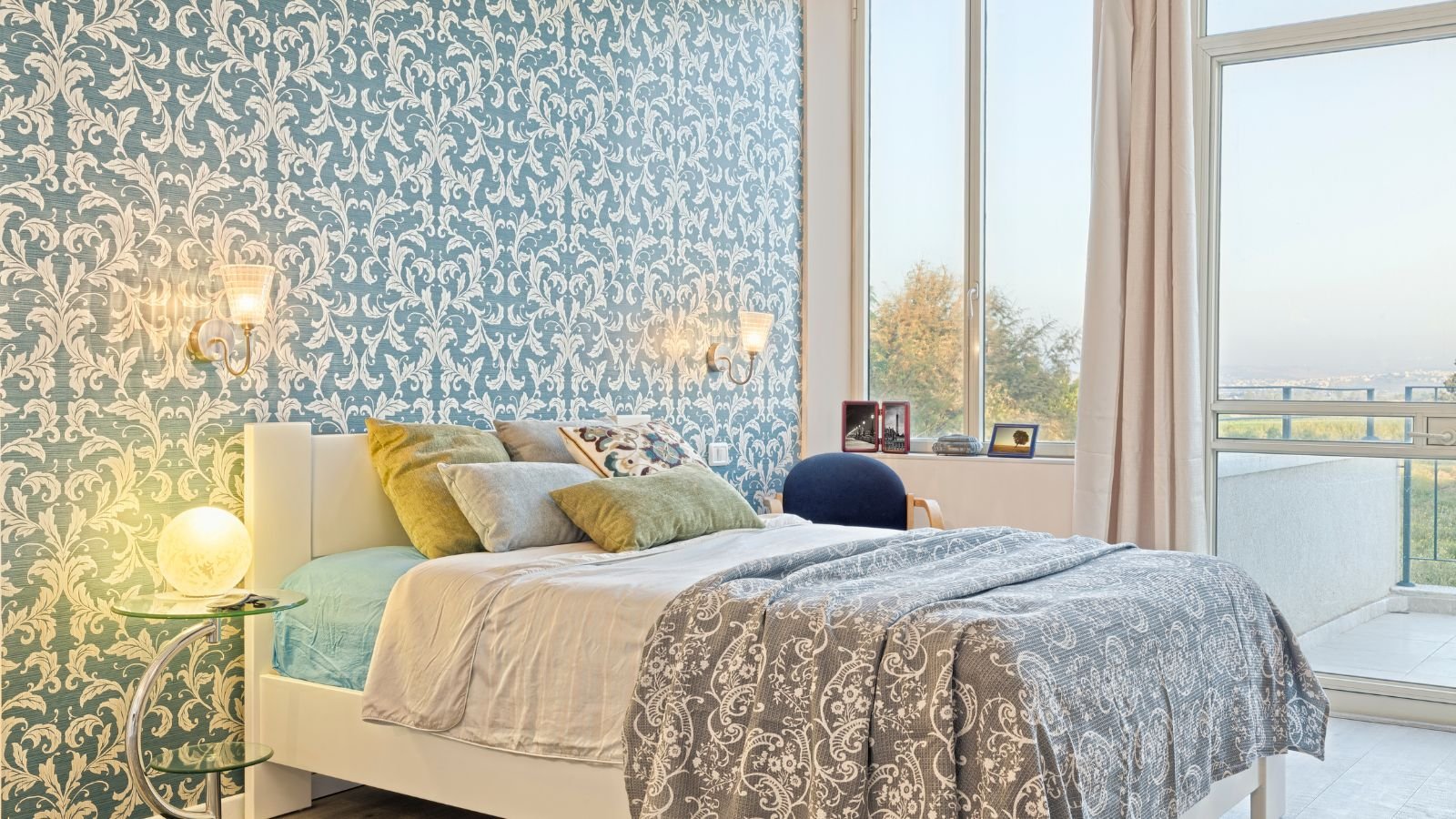
Busy floral patterns, damask designs, and deep borders were hallmarks of Victorian-style wallpaper. While some find the intricate details charming, this style can overpower a room and make it feel dated. Modern trends lean towards simpler patterns, textured wallpapers, or even painted walls with accent features. These choices create a more breathable and contemporary feel.
Stuffed Furniture
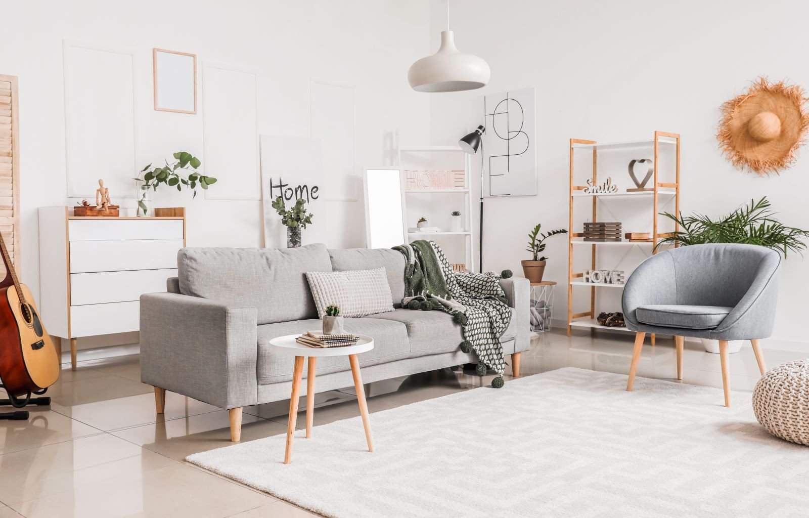
Overstuffed sofas and armchairs, once seen as symbols of comfort and luxury, can now appear bulky and outdated. Excessive padding can overwhelm a space and make it challenging to move around. Overstuffed furniture also features floral patterns or ornate upholstery fabrics, further contributing to a dated look. Today’s trends favor furniture with clean lines, sleek profiles, and a focus on functionality.
Collections Displayed on Open Shelving
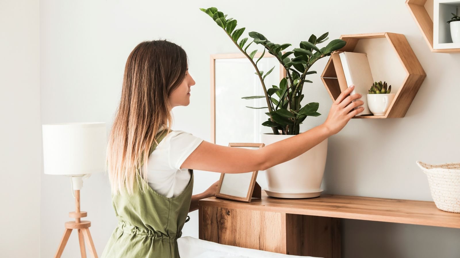
Open shelving crammed with figurines, knickknacks, and various collectibles was once a popular way to showcase personal treasures. However, this approach can create a cluttered and visually overwhelming space, and dusting individual items can also be a chore. Modern trends favor a more curated approach to displaying collections. This might involve using closed cabinets with glass doors for precious items or displaying a few pieces on minimal shelving.
Faux Finishes

Techniques like faux marble countertops, painted brick walls to resemble exposed brick, or wallpaper imitating wood paneling were once used to create a more luxurious look on a budget. However, these imitations can often appear cheap and unconvincing upon closer inspection. Modern trends favor using real materials whenever possible or opting for high-quality alternatives that authentically mimic the look and feel.
Hurricane Lamps
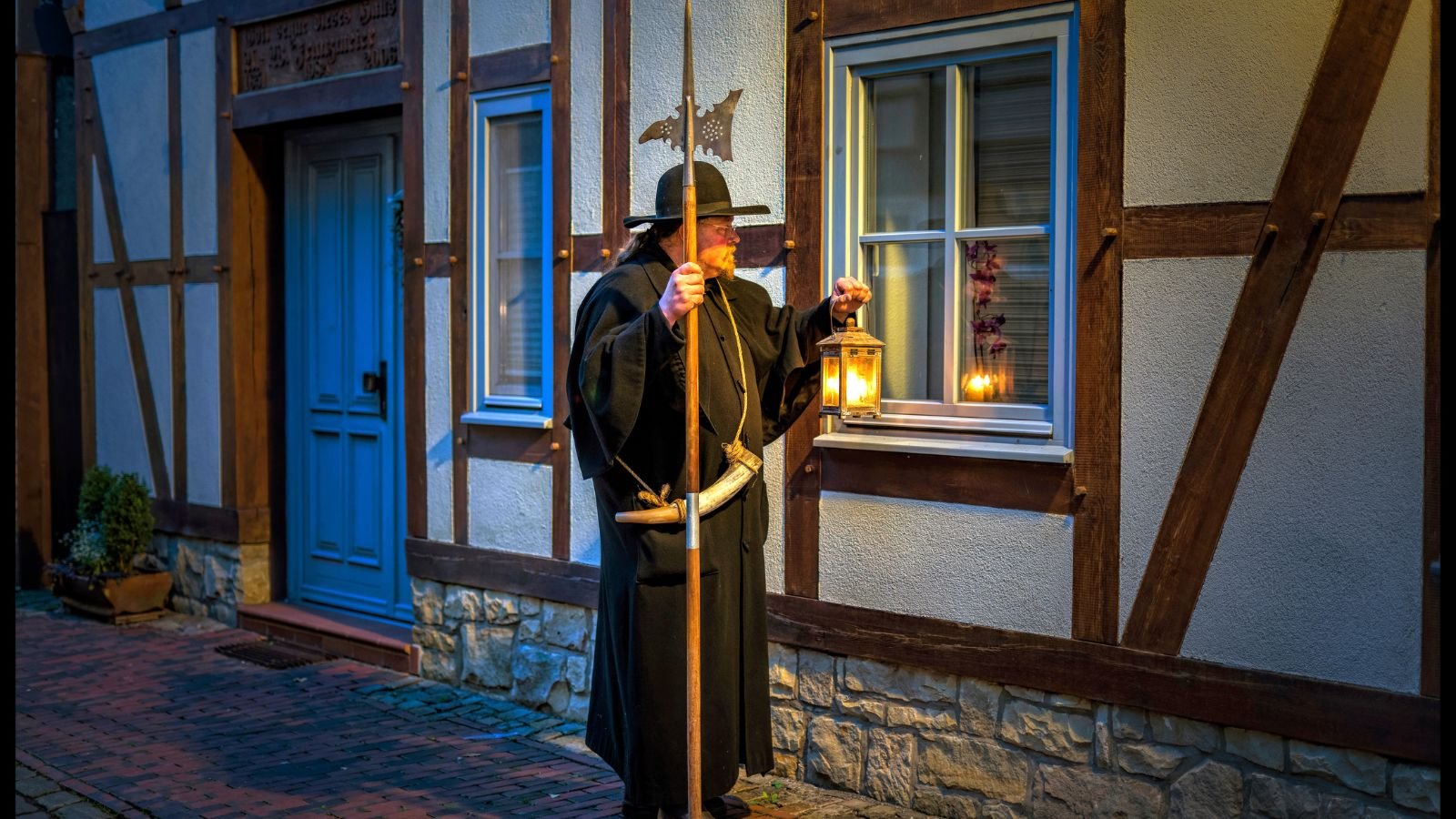
These glass lamps featuring a metal base and a globe-shaped shade were once a staple in living rooms and bedrooms. However, their traditional style can appear dated in contemporary settings. The enclosed design can also limit light distribution, creating a dim atmosphere. Modern trends favor lamps with clean lines, exposed bulbs, and unique materials like woven baskets or metal mesh, providing both style and functionality.
Stuffed Animal Collections
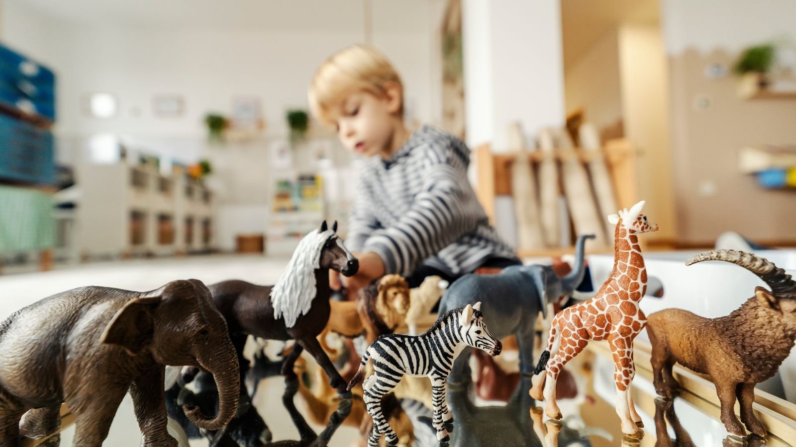
While cherished keepsakes, extensive displays of stuffed animals can make a living space feel childish or cluttered. A curated selection of sentimental favorites displayed tastefully on a shelf or in a child’s room might be more appropriate. Modern trends lean towards incorporating natural elements or abstract art pieces to add personality and visual interest to a space.
Formal Furniture Arrangements

Traditionally, furniture was arranged in formal groupings, often centered around a fireplace or coffee table. This approach can create a sense of rigidity and limit conversation flow. Today’s focus is on creating conversation areas that encourage interaction. Furniture might be arranged in clusters or facing each other, promoting a more social and inviting atmosphere.
Heavy Window Treatments
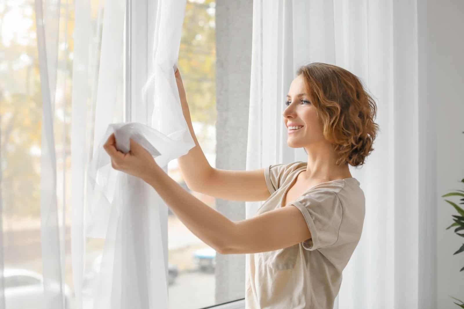
Once a popular choice for adding privacy and insulation, heavy drapes and elaborate window treatments can make a space dark and dated. Modern trends favor lighter, more breathable fabrics that allow natural light to flow through. Simple blinds or sheer curtains offer a more contemporary look while providing privacy and light control.
Popcorn Ceilings

Once a popular way to hide imperfections and improve acoustics, popcorn ceilings are now seen as outdated and unattractive. The rough texture can collect dust and cobwebs, making them difficult to clean. Additionally, they visually lower the ceiling height, making a room feel smaller. Modern trends favor smooth, flat ceilings that create a clean and airy feel. These can be enhanced with recessed lighting or decorative moldings for added visual interest.
Country Cottage Collections
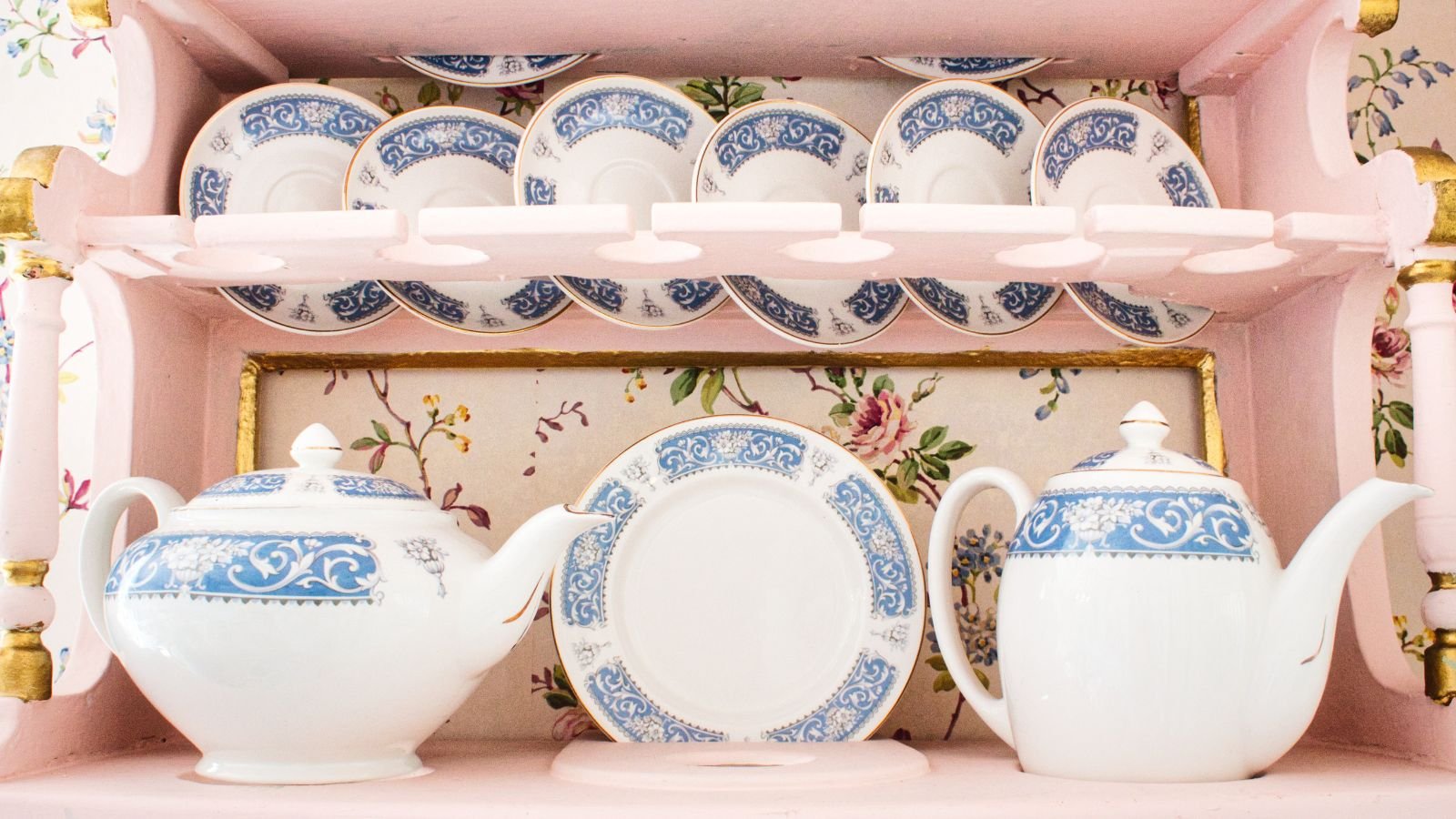
Extensive displays of ceramic roosters, floral teacups, and other country cottage-themed knick-knacks can appear kitschy and overwhelming. While a few well-chosen pieces can add charm, a cluttered collection can make a space feel outdated. Modern trends favor a more minimalist approach, using curated collections with a focus on functionality or a unified color palette.
Needlepoint Samplers

Hand-stitched creations can hold sentimental value, but displaying a large collection of needlepoint samplers can make a space feel dated and overly traditional. The often stiff lettering and folksy motifs might clash with modern aesthetics. Consider framing a single favorite sampler or incorporating it into a more eclectic display with other textiles for a more curated look.
